AIA4 · Demo Portfolio

EHS Website Portfolio

20 environmental, health & safety consulting firms. 20 concept rebuilds — their brand (logo, colors, type), our conversion framework and photography. Each card shows the site as it exists today; each link shows what it could be.

20concept sites
100generated pages
4markets
2dead/hijacked domains rescued

Houston, TX

5 firms · current sites captured 2026, scored for design and conversion readiness.

Before Current Berg Compliance Solutions website — before Design 6/10

Berg Compliance Solutions

Houston, TX · bes-corp.com

  • Hero photo is buried under a near-black overlay so the imagery is illegible, and the left-aligned text block collides with the subject of the photo
  • Endless single-page scroll with 16+ unbroken plain-text testimonials and lazy-load placeholder SVGs where half the client logos should be
  • Brand confusion: domain and candidate name say 'BES' while the site is branded Berg Compliance Solutions with an Austin address, plus GDPR cookie panel clutter on a Texas-market site
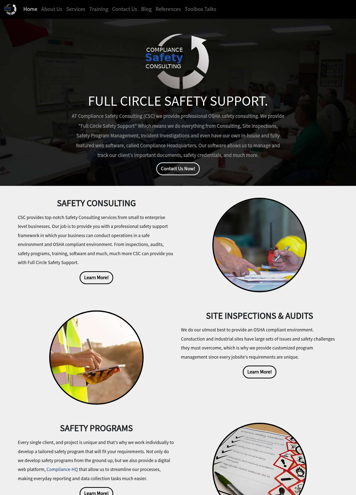
Before Current Compliance Safety Consulting website — before Design 4/10

Compliance Safety Consulting

Houston, TX · csc-safety.com

  • Hero is a dark, low-contrast classroom photo with the full logo pasted in the middle and a wall of centered paragraph text as the headline ('FULLCIRCLESAFETYSUPPORT.' renders with missing spaces)
  • Dated circular photo crops with heavy black borders and generic outlined 'Learn More!' pill buttons on a flat gray Bootstrap page
  • No phone number, email, or address anywhere; the only conversion path is a long reCAPTCHA contact form on a separate page titled 'HIRE US NOW!'
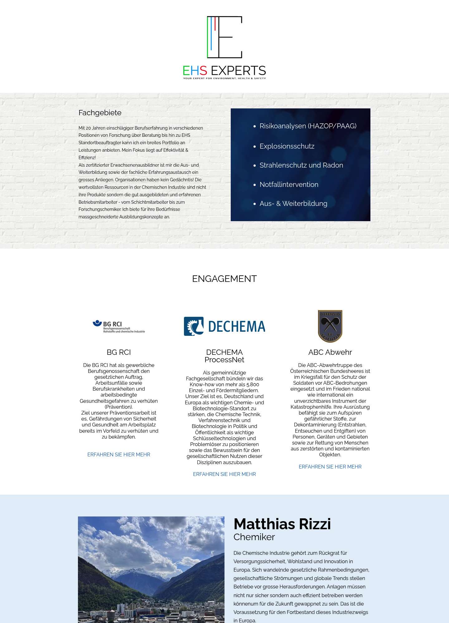
Before Current EHS Experts website — before Design 3.5/10

EHS Experts

Houston, TX · ehs-experts.com

  • Fixed 970px non-responsive One.com site-builder layout (viewport=width=970) with a floating logo instead of a header, and no navigation beyond a single 'Kontakt' link
  • No hero, no value proposition, and zero conversion elements above the fold; content is entirely German for a one-person Swiss consultancy despite ranking in Houston results
  • Cramped three-column partner-logo blocks with tiny centered text, brick-texture background band, and no phone, address, or email anywhere on the site
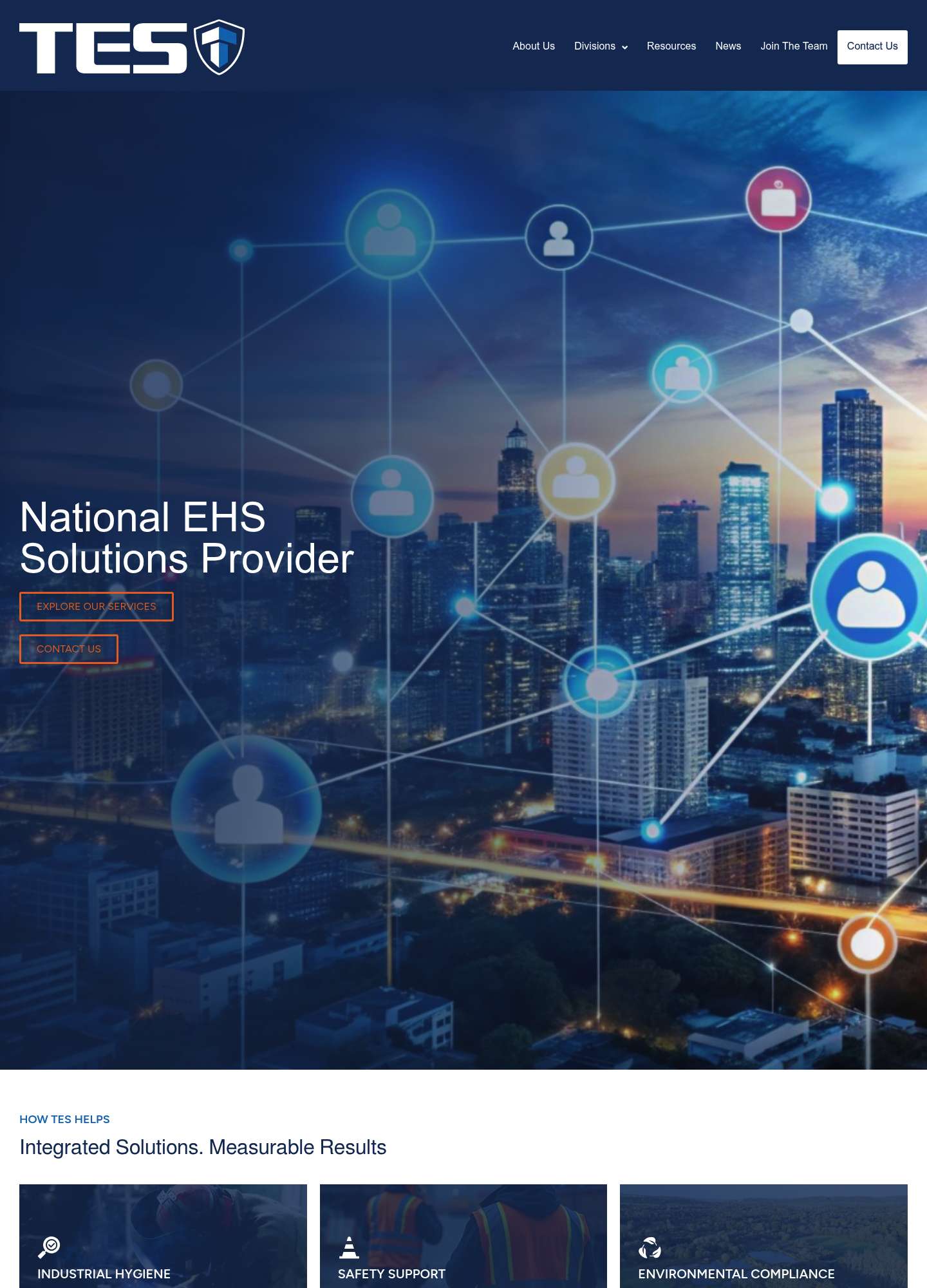
Before Current TES - Technical Environmental Services website — before Design 6.5/10

TES - Technical Environmental Services

Houston, TX · tesconsult.com

  • Primary CTAs are thin orange outline buttons in small caps sitting on a busy dark hero image - very low contrast and easy to miss
  • Generic 'digital network over city skyline' stock hero has nothing to do with field EHS work, and the site falls back to default system fonts (no brand typeface)
  • Repeated 'HOW TES HELPS' eyebrow labels, dense text sections, and off-tone culture copy ('Get sh*t done', 'Be the Bison') undermine hierarchy and trust for enterprise buyers
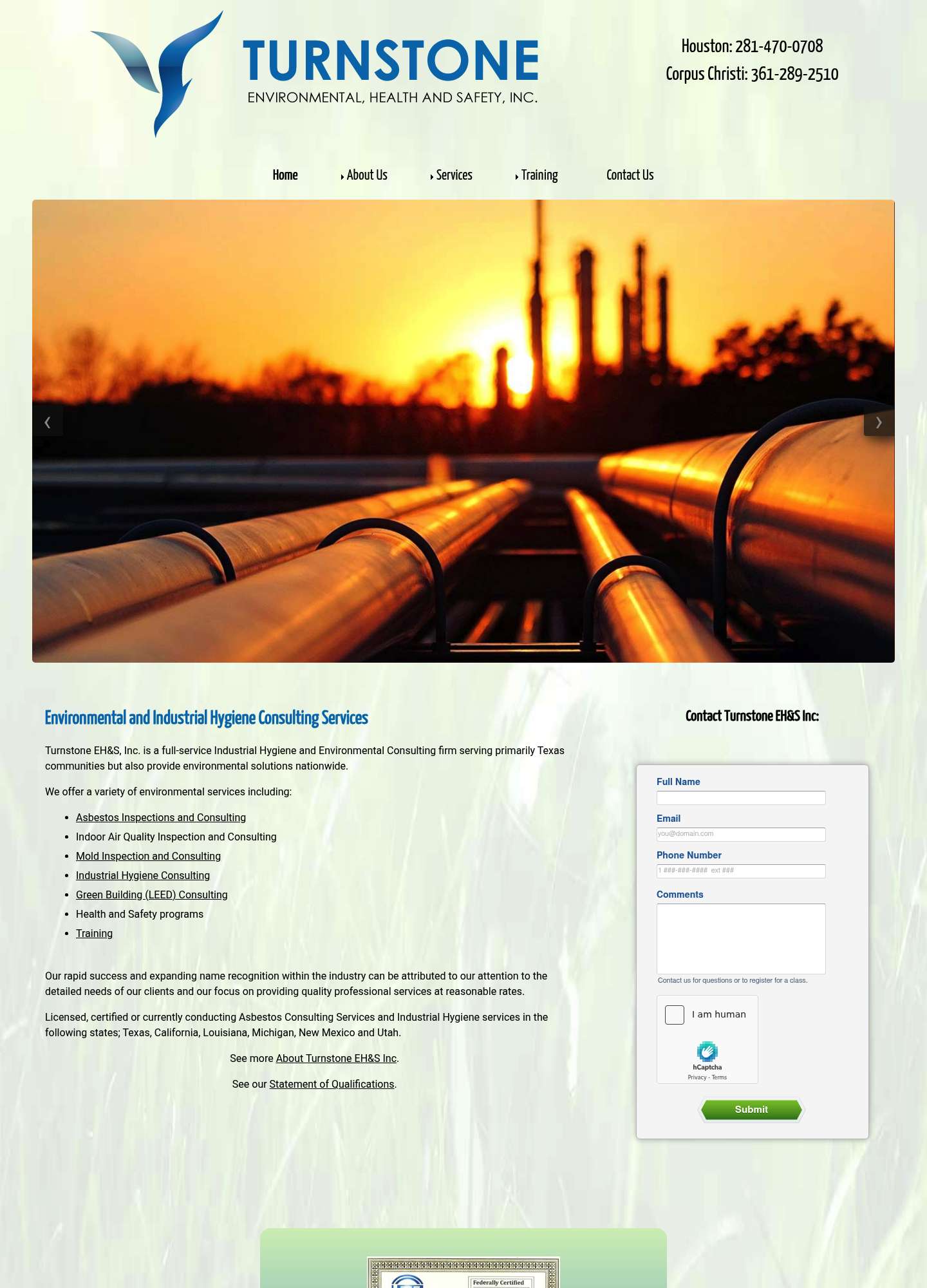
Before Current Turnstone Environmental, Health and Safety website — before Design 3/10

Turnstone Environmental, Health and Safety

Houston, TX · turnstoneehs.net

  • Circa-2010 boxed template with a tiled grass-texture page background and jQuery slider arrows overlapping the hero photo
  • Clashing typography: condensed Yanone Kaffeesatz headings in bright green/blue against default-styled body text with underlined link lists as primary content
  • Homepage conversion path is a raw sidebar contact form with a visible hCaptcha widget and placeholder alt-image; no CTA buttons or visual hierarchy anywhere above the fold

New York, NY

5 firms · current sites captured 2026, scored for design and conversion readiness.

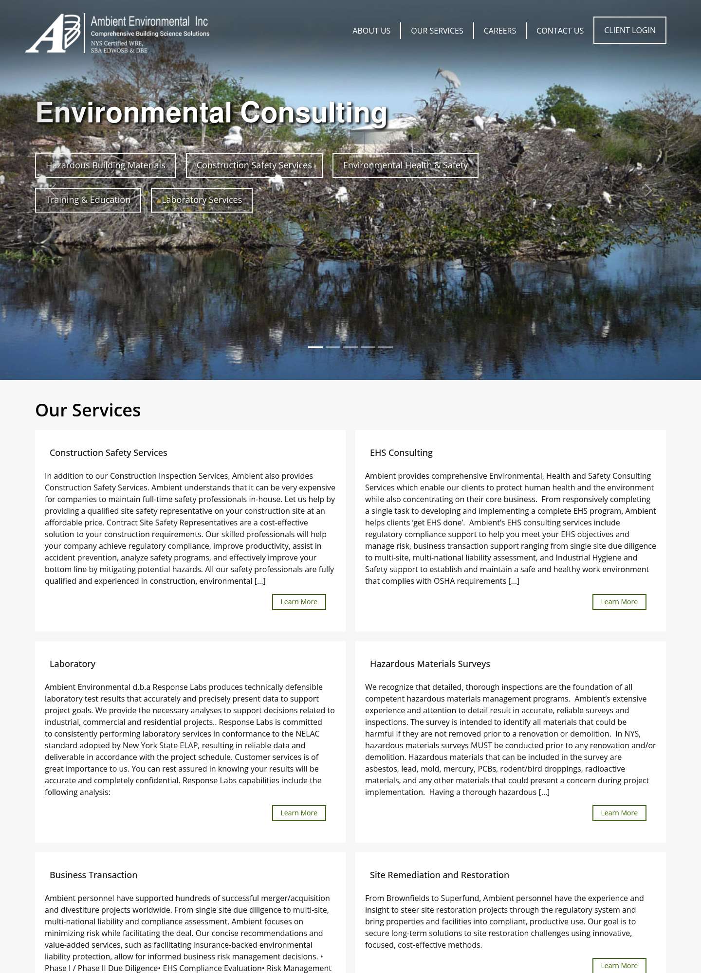
Before Current Ambient Environmental website — before Design 4/10

Ambient Environmental

New York, NY · ambient-env.com

  • Hero is a generic nature-stock carousel with drop-shadowed text buttons scattered over the photo and no headline hierarchy or CTA
  • Service cards are dense walls of paragraph text that literally truncate mid-sentence with '[...]', forcing reading fatigue
  • Mid-2000s template aesthetic: tiny gray logo, thin default typography, no trust signals (clients, certifications, reviews) above the fold
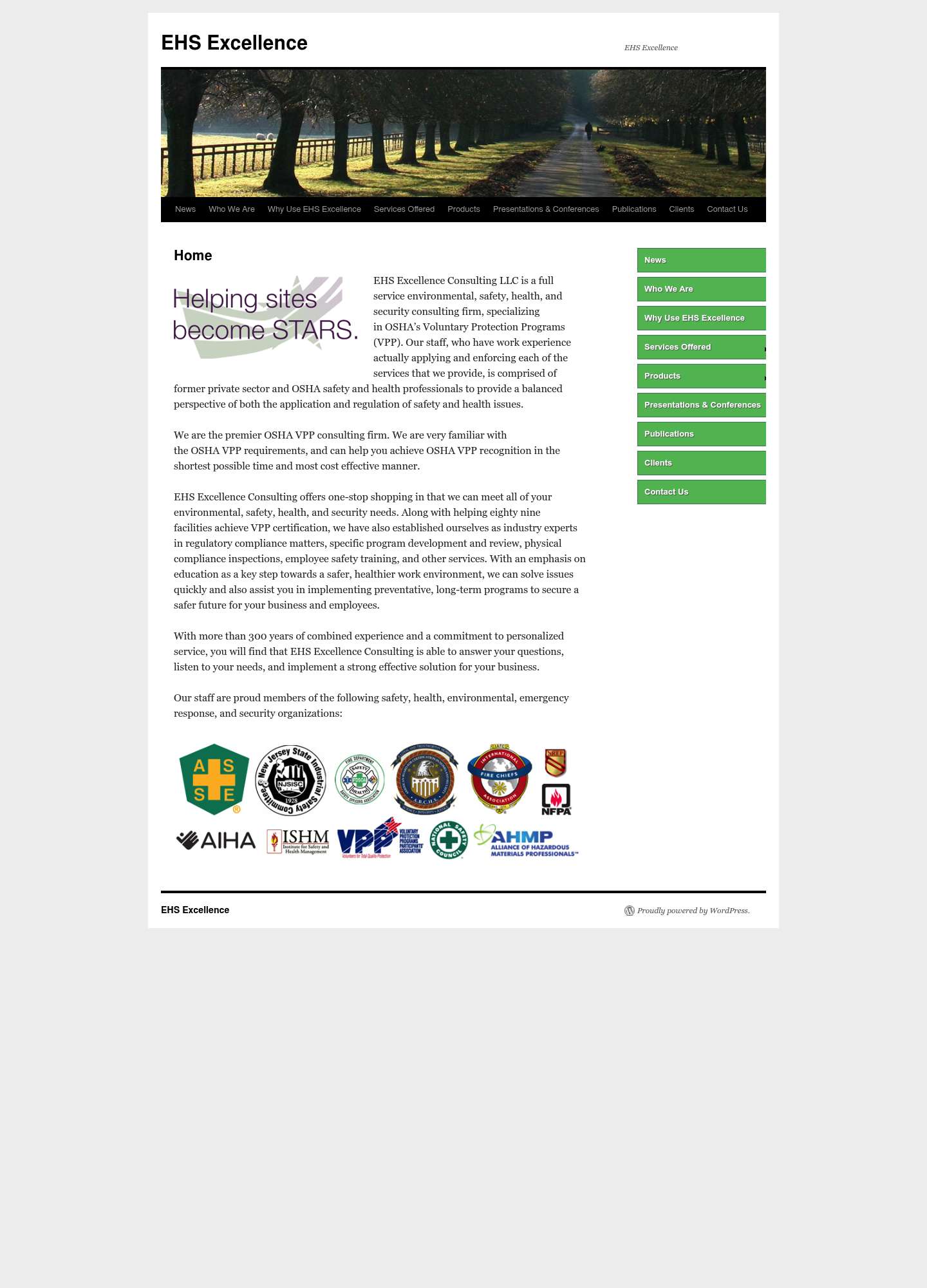
Before Current EHS Excellence Consulting website — before Design 3/10

EHS Excellence Consulting

New York, NY · ehs-excellence.com

  • Unmodified circa-2010 WordPress Twenty Ten theme: fixed-width boxed layout, default Georgia serif body, stock tree-lined-road header photo unrelated to EHS
  • Green sidebar buttons duplicate the top navigation exactly, wasting the entire right column with redundant links
  • Trust section is a strip of low-resolution association logos pasted at mismatched sizes; no CTA, imagery, or conversion element anywhere on the page
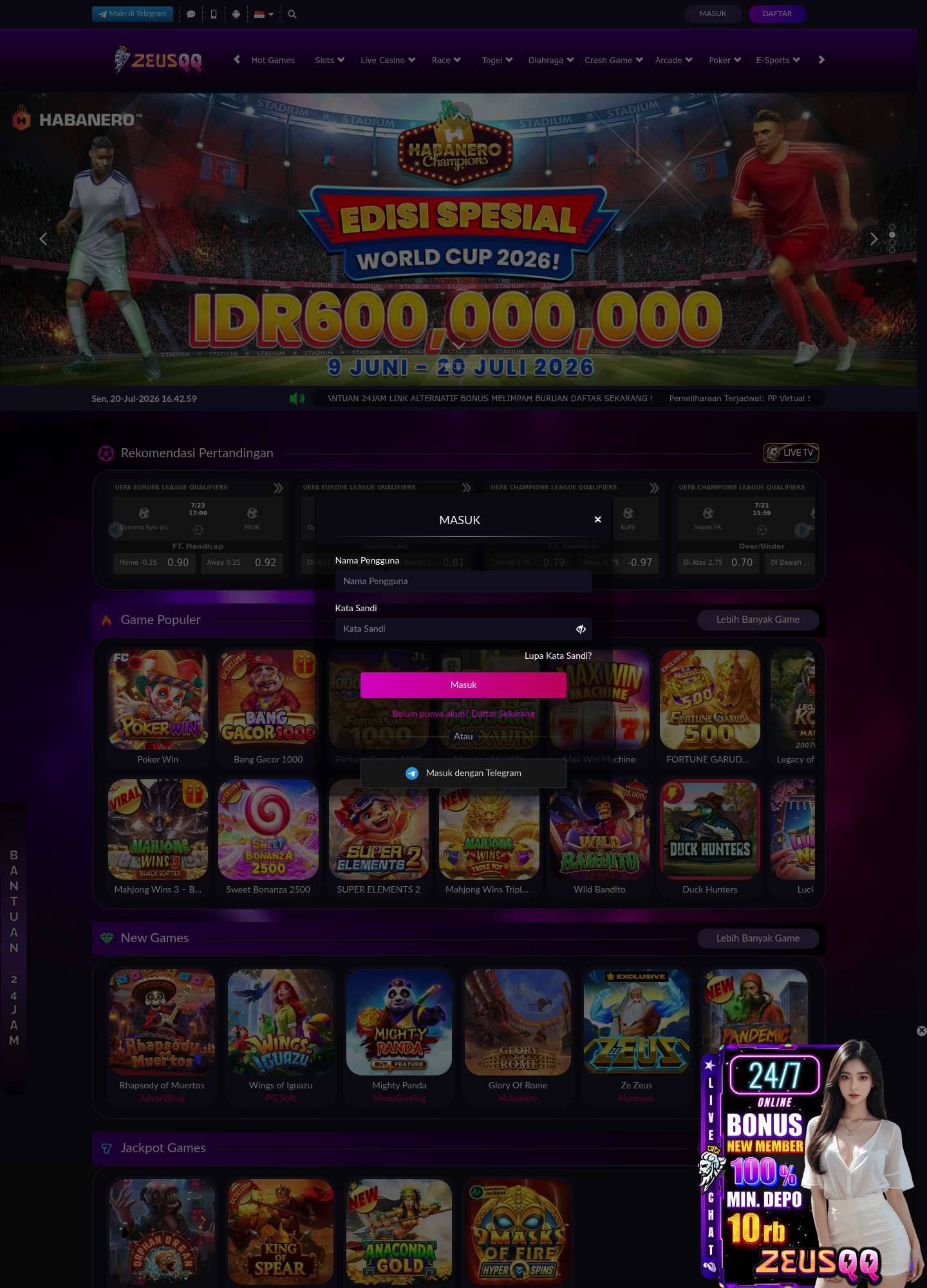
Before Current EHS Compliance Associates website — before Design 1/10 Domain hijacked — full rebuild demo

EHS Compliance Associates

New York, NY · ehscomplianceassociates.com

  • Domain is expired/hijacked: ehscomplianceassociates.com now redirects to 'ZEUSQQ' (zeusqqfly.com), an Indonesian online gambling/slots site — no EHS content exists
  • Any customer, backlink, or search result pointing at the firm's domain lands on casino promos, login modals, and betting odds in Indonesian
  • Complete loss of brand identity: no company logo, services, contact info, or trust signals recoverable from the live domain (extraction failure noted 2026-07-20)
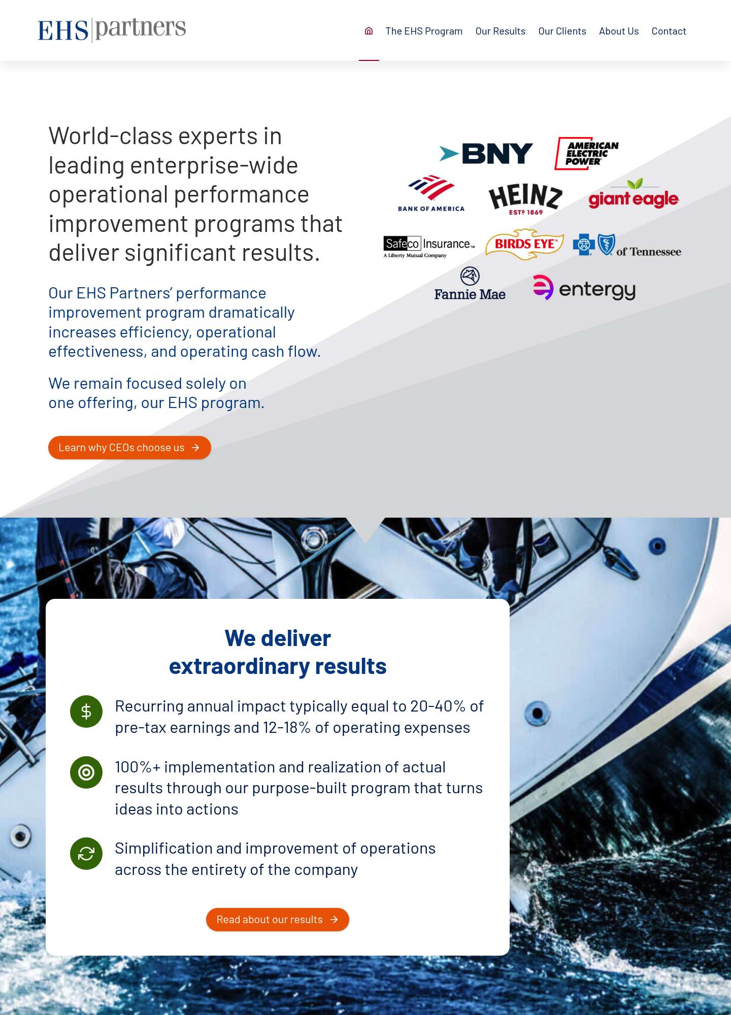
Before Current EHS Partners website — before Design 6/10

EHS Partners

New York, NY · ehspartners.com

  • Dated gray diagonal-wedge hero gradient (early-2010s corporate template look) fights the content column
  • Hero imagery is irrelevant stock sailing photography with no connection to the consulting offering
  • Client logo wall is a jumble of mixed sizes, colors and alignments with no grid, weakening the trust section
Before Current MAE Consultants website — before Design 3.5/10

MAE Consultants

New York, NY · maeconsultants.com

  • 120px hero headline is overlaid on a busy dark event photo with people's heads in the foreground — poor contrast and no focal point
  • Above the fold contains zero services, value proposition, or CTA; nav has only two links ('Request an Inspection', 'Resources') on a single long page
  • No phone number or email anywhere on the site — the only conversion path is a long multi-field form; accent color is the unstyled default link blue

Las Vegas, NV

5 firms · current sites captured 2026, scored for design and conversion readiness.

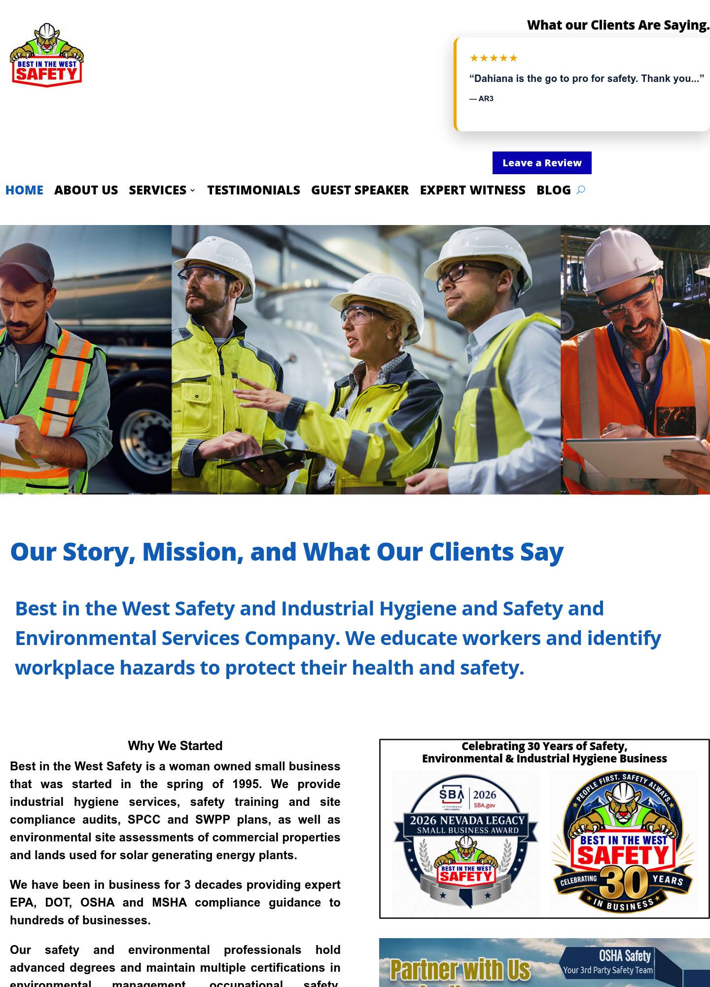
Before Current Best in the West Safety website — before Design 3/10

Best in the West Safety

Las Vegas, NV · biwsafety.com

  • Broken header: a Google-review widget and 'Leave a Review' button float above the nav with a large dead-white gap, pushing the hero far down the page
  • Cartoon cougar mascot logo and clip-art award badges clash with the corporate blue palette and undermine professional credibility
  • Dense justified text walls in the 'Why We Started' section with no primary CTA, phone number, or contact form visible above the fold
Before Current HERServices website — before Design 1/10 Dead domain (parked) — full rebuild demo

HERServices

Las Vegas, NV · herservices.com

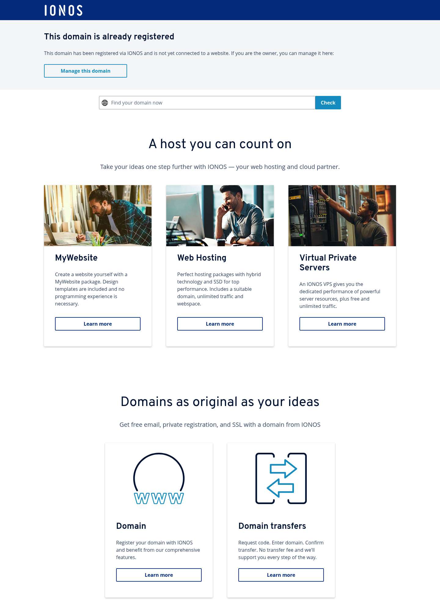
  • Domain is dead: visitors land on an IONOS registrar parking page advertising hosting products instead of the company
  • Zero brand presence — no logo, services, phone, or contact path anywhere on the domain
  • All search traffic and referral equity for a 31-year-old firm is being lost to a parked page
Before Current Logistical Solutions website — before Design 6/10

Logistical Solutions

Las Vegas, NV · losonow.com

  • Hero headline and body copy sit directly on a busy vacuum-truck photo with weak overlay, hurting readability
  • Ultra-condensed Teko display type at 85px gives a dated heavy-industrial-template look that fights the professional consulting positioning
  • Generic three-card 'See Details' template blocks (built on the Jazel dealer-site platform) with repetitive stock imagery and no differentiated proof points
Before Current Phase 1 Environmental Consulting website — before Design 5/10

Phase 1 Environmental Consulting

Las Vegas, NV · phaseonereport.com/las-vegas-nevada-phase-1-esa-company

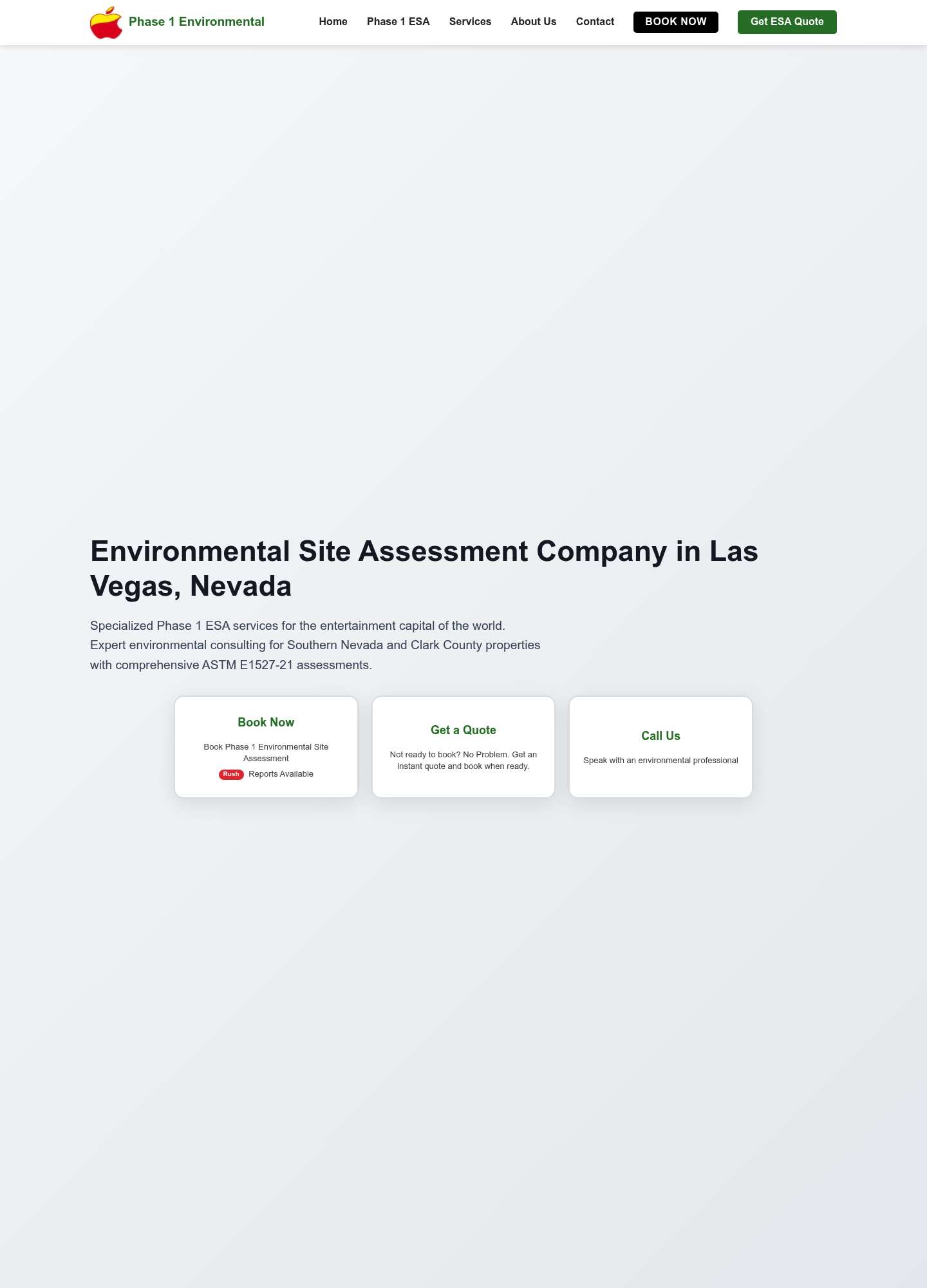
  • Hero image fails to load, leaving roughly 700px of empty gray gradient before the H1 — massive wasted first screen
  • Programmatic city-page template (identical copy structure reused per metro, page even set to noindex) with stock testimonial headshots that erode authenticity
  • Apple-shaped icon logo has no connection to environmental services, and the embedded 'Video unavailable' YouTube error plus placeholder map damage trust
Before Current Walsh Certified Consultants website — before Design 3/10

Walsh Certified Consultants

Las Vegas, NV · walshcih.com

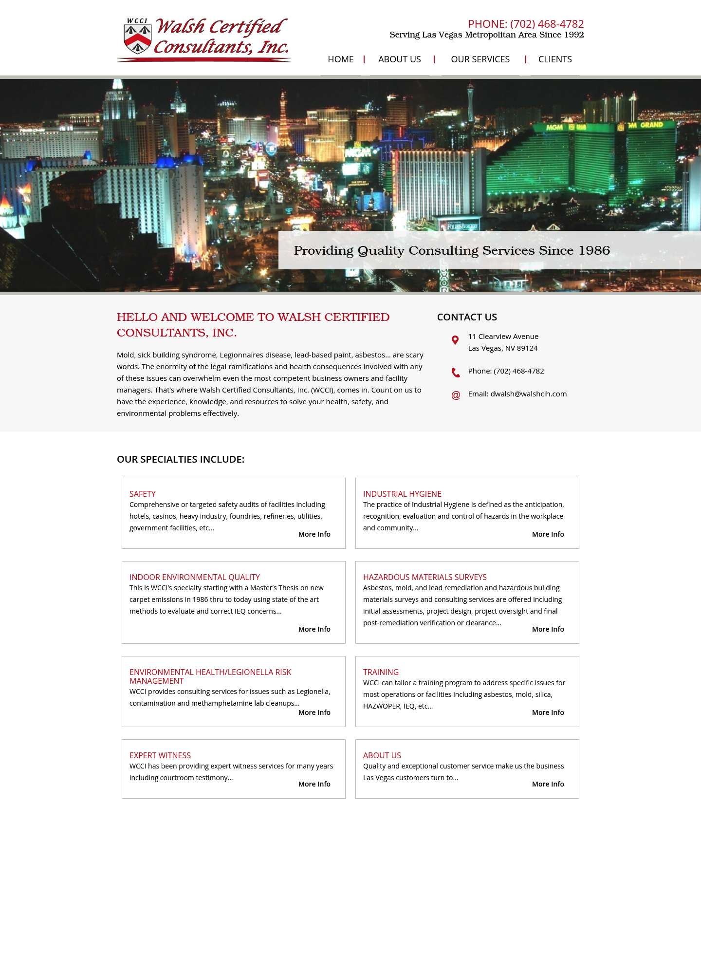
  • Mid-2000s layout: low-resolution Vegas Strip night stock photo hero with a gray beveled caption bar and drop-shadow serif text
  • Services presented as plain thin-bordered text boxes with tiny 'More Info' links — no icons, imagery, or CTA buttons anywhere on the page
  • Dated crest-and-script logo, cramped 14px body type, and a large empty footer region signal an unmaintained site despite strong credentials

Los Angeles, CA

5 firms · current sites captured 2026, scored for design and conversion readiness.

Before Current A-Tech Consulting website — before Design 5/10

A-Tech Consulting

Los Angeles, CA · atechinc.net

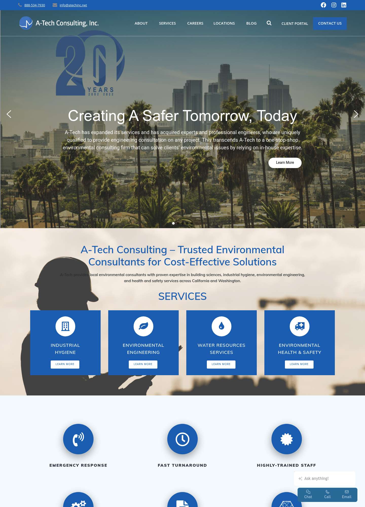
  • Auto-rotating hero slider still leads with a '20 Years 2002-2022' anniversary badge - four years stale - over a busy palm-tree skyline photo with thin white text
  • Flat cobalt service boxes and repeated icon-circle rows create a monotonous 2015-era Elementor look, with a translucent worker-silhouette background fighting the text for legibility
  • Conversion clutter: floating Chat/Call/Email dock, 'Ask anything!' AI widget, cookie banner, and carousel arrows all stack over content instead of one clear CTA path
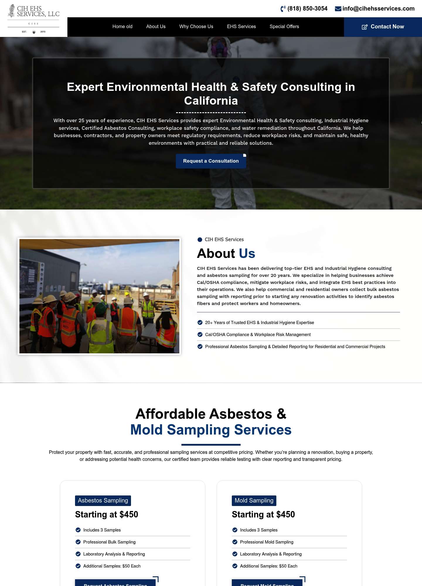
Before Current CIH EHS Services website — before Design 4/10

CIH EHS Services

Los Angeles, CA · cihehsservices.com

  • Navigation still contains the dev artifact label 'Home old' - an unfinished template shipped to production
  • Hero is a dark translucent text box floated over an already-dark photo, producing low-contrast, hard-to-read copy and a hidden subject in the background image
  • Grayscale low-resolution scan used as the logo (IMG_5375.png), generic Arial system typography, and duplicated service blocks (Exterior Walking Surface Evaluation appears twice)
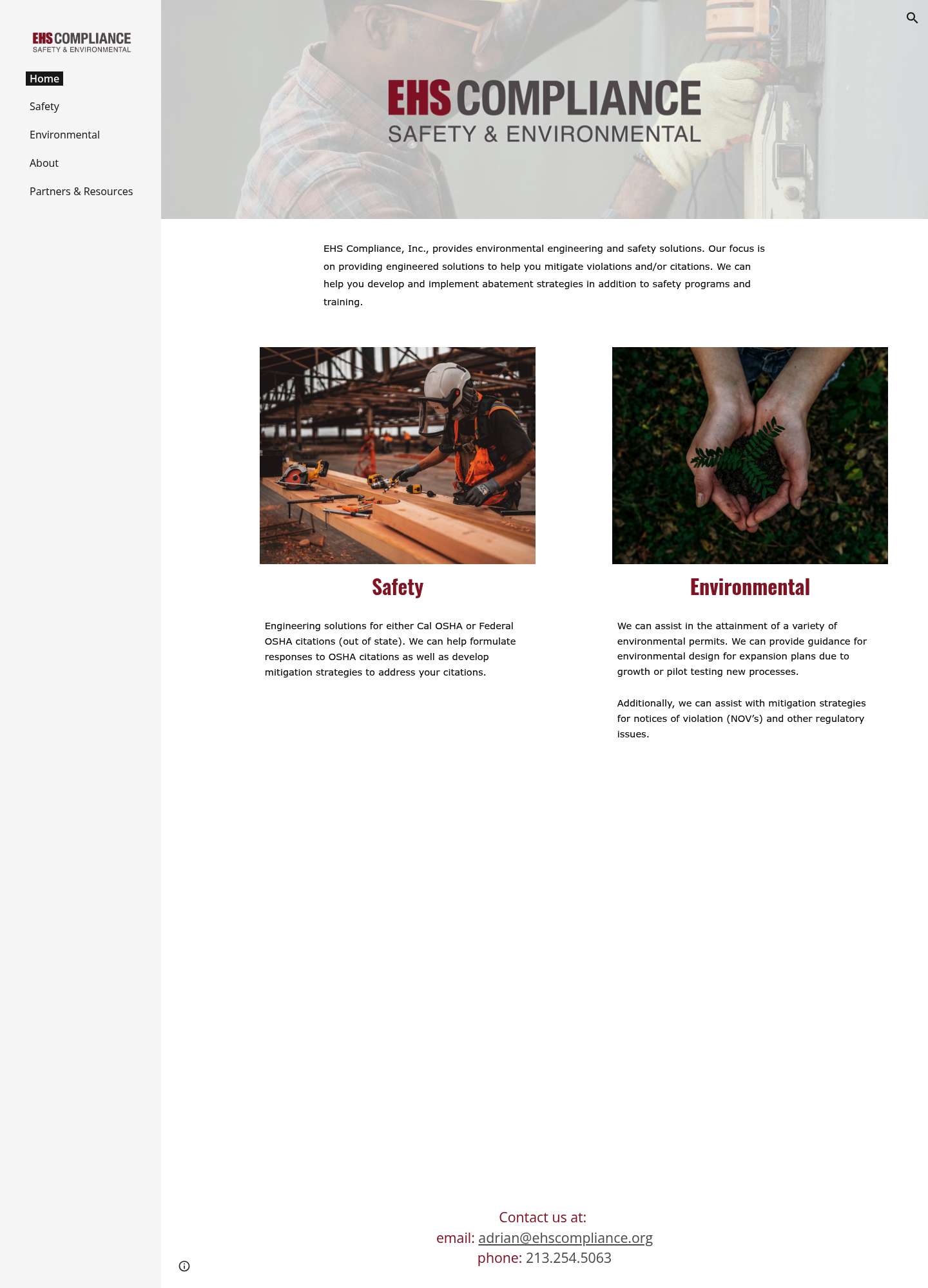
Before Current EHS Compliance website — before Design 2/10

EHS Compliance

Los Angeles, CA · ehscompliance.org

  • Built on a bare Google Sites template with a giant watermarked logo floating over a washed-out stock hero photo
  • No conversion elements at all - no CTA buttons, no contact form; email and phone are buried as plain text at the very bottom of the page
  • Massive dead whitespace between the two thin service blurbs and the footer, with default blue hyperlink styling and near-zero visual hierarchy
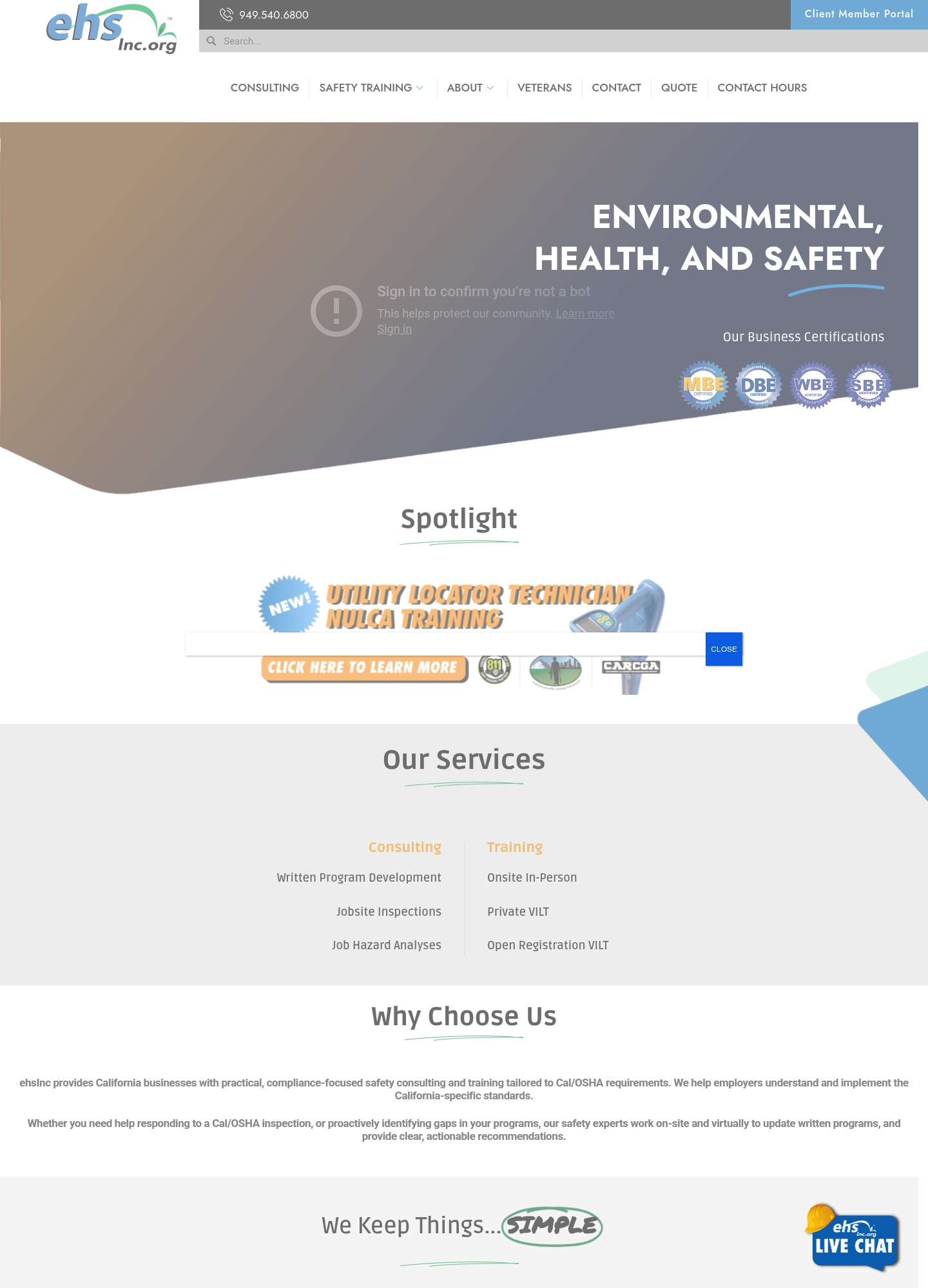
Before Current ehsInc website — before Design 3/10

ehsInc

Los Angeles, CA · ehsinc.org

  • Hero is a broken embedded YouTube video - ghost 'Sign in to confirm you're not a bot' overlay text renders directly on the diagonal gradient hero, destroying credibility
  • 'Spotlight' section is a clip-art banner ad with a 'NEW!' starburst and 'CLICK HERE TO LEARN MORE' pill, plus a stray CLOSE popup button overlapping it
  • Chaotic visual language - random diagonal color blobs, hand-drawn underline squiggles, four low-res certification badge graphics, and a cartoonish hard-hat live-chat mascot competing for attention
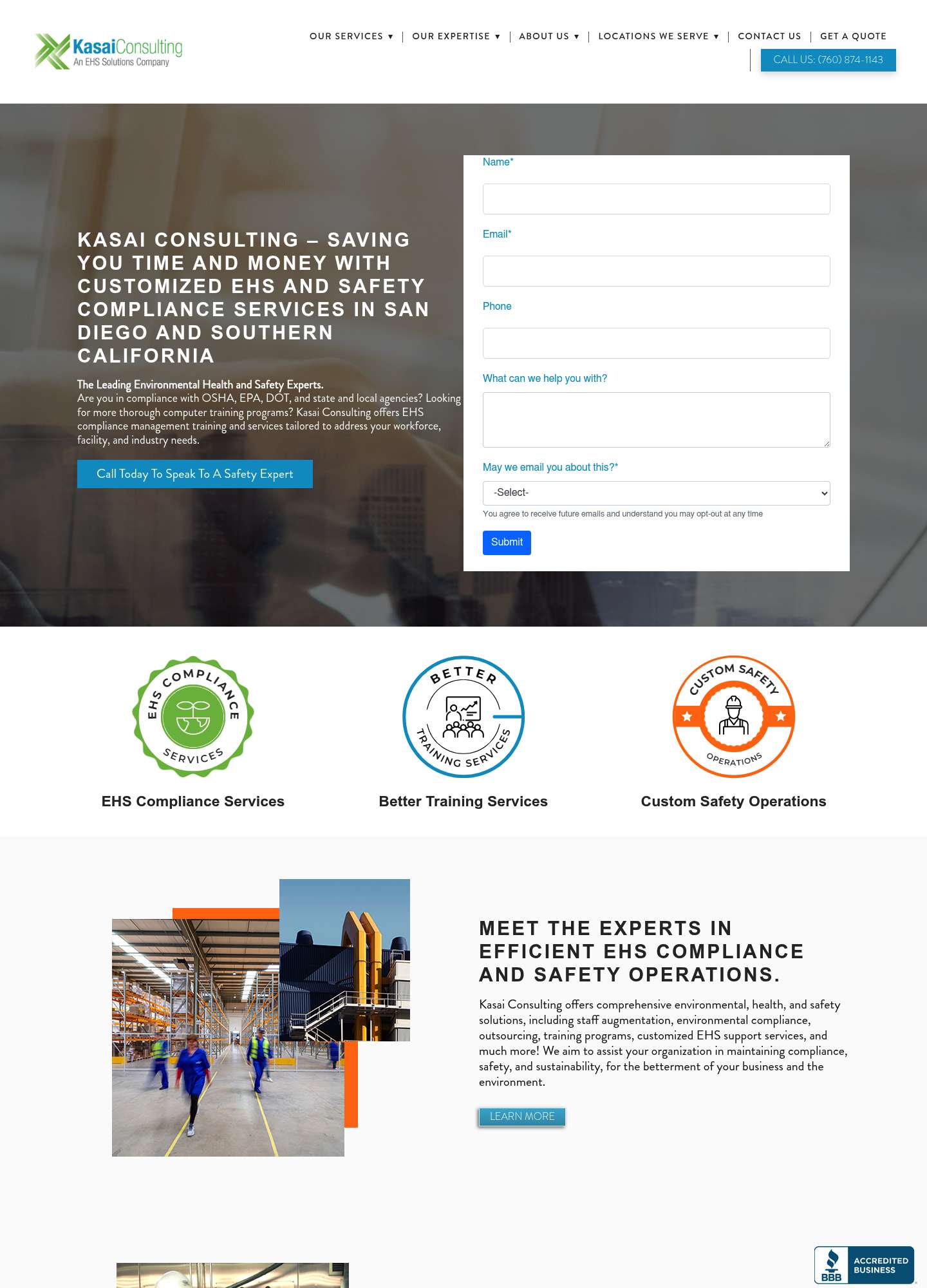
Before Current Kasai Consulting website — before Design 4/10

Kasai Consulting

Los Angeles, CA · kasai-consulting.com

  • Hero crammed with a six-line all-caps letterspaced headline next to a raw unstyled lead form (default browser inputs, tiny generic Submit button) over a muddy translucent photo
  • Three clip-art badge icons in clashing green, blue, and orange break any palette cohesion, and the orange/teal brand colors are applied inconsistently across buttons and links
  • Dated mywebsites360 builder template - messaging headlines are San Diego-focused, content blocks are duplicated verbatim down the page, and imagery is a cramped overlapping collage